A branding experience that makes the audience feel reawakened and refreshed as they come to Rooted for fitness and wellness services – an identity that is bold, organic, empowering, spiritual, inviting, and personal.
Project Overview
Brenna came to me with her ideas of starting a fitness studio in small town, rural Iowa with services in nutrition, personal and small group training, and group fitness classes. She explained how she saw, and experienced, a lack of guidance or empowerment for women in every step of their fitness and wellness journey. Brenna expressed that she wanted this brand to connect with women who feel ill-equipped, discouraged, or unmotivated, and educate, equip, and empower those women to feel confident and know this is for them. She wants to provide a space and an environment that shows us health doesn’t have to be complicated and that everyone can have a chance to start over. Right where you are.
Brenna has a mission through Rooted to educate, equip, and empower other people to live healthier lives.
We began the branding process by selecting a name for Brenna’s business. Brenna’s husband, Chase, owns a business in a similar industry called “The Stalk” so we wanted to be aligned with that name but also have it be it’s own entity as well. We landed on Rooted. Rooted is a strong word and as you’ll see in the design elements, can be interpreted in a couple of ways.
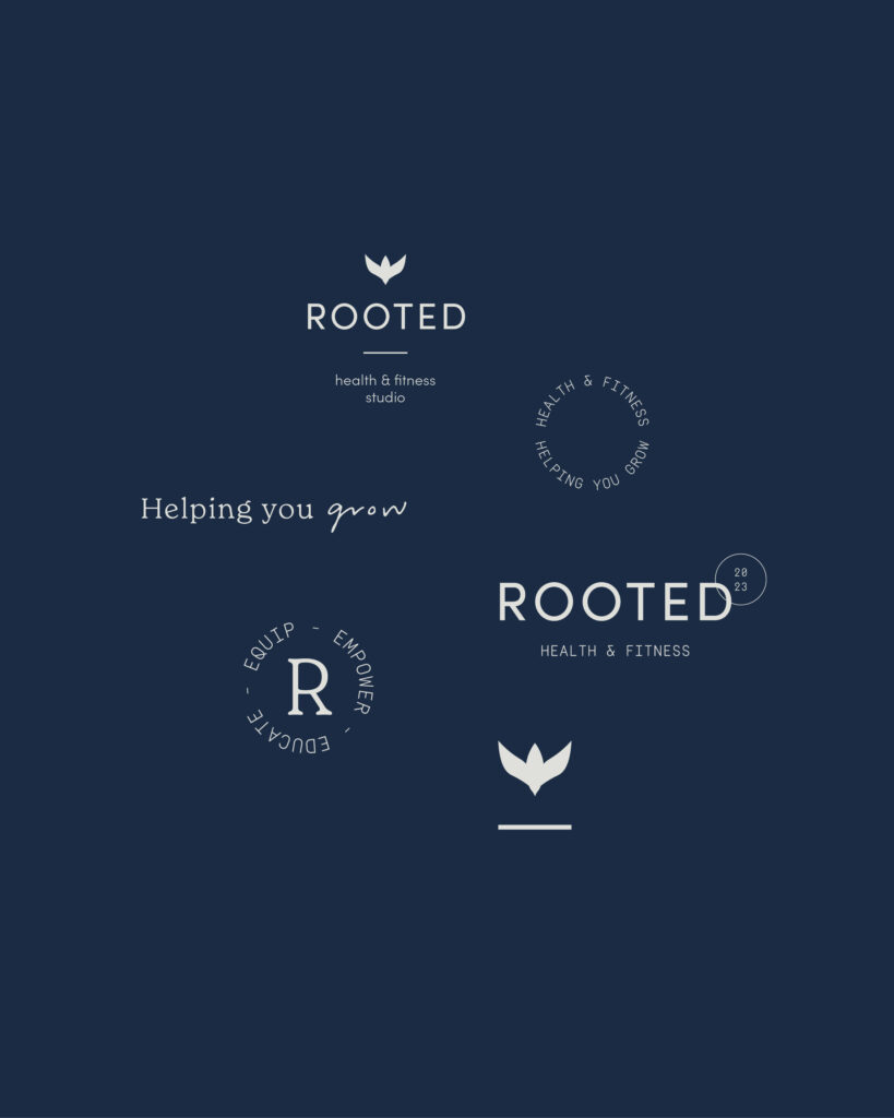
The icon for Rooted is an abstract dove in flight as well as a growing flower or plant. Both of these resemble growth or giving someone the foundation to be able to fly or building them up in their wellness journey. The dove ties in Brenna’s faith, being a symbol of spirituality and being ‘rooted’ in both fitness and faith. Also, birds fly together, which resembles the group-fitness side of Rooted. The plant resembles being rooted in your commitment to better health and watching the process of growth and blossoming. The primary fonts are bold and straightforward with fun accent fonts that give the brand a feminine quality. We also came up with taglines and consistent messaging for Rooted’s brand including, “helping you grow,” “confidence for every body,” and “take your health back into your own hands.”
Rooted’s color palette includes organic shades of green and blues with a gold/tan accent. The palette feels earthy, organic, and relatable. The darker shades of green, blue, and brown suggest motivation and empowerment whereas the lighter shades give a more calming vibe.
Inspiration for this brand included refreshing mornings, moving your body, exercise, taking a walk at your favorite trail, the human body, creation, sunrises and sunsets, balance, plants and natural material, wellness, and spirituality.
I’m so grateful to have gotten to work on this project with Brenna. I’m so encouraged by the final product, and I can’t wait to see how she incorporates the design elements in her business as well as change the lives of women in Iowa.

Services
Business naming, custom brand design, messaging & taglines, photo direction


Kind Words from Brenna
“I came to Claire with a vision for a new business but had no idea what creative direction I wanted to take with it (not even a for sure name for it yet). She listened to all of my ideas and aspirations and was awesome to communicate with. She made each step of the process so easy for me narrow down exactly what I wanted my brand to convey and completely blew me away with the final product. Since we finished working together, she has also been there to answer all of my questions about how to use the different aspects of my brand, formats, fonts, etc. I also love that her faith plays an integral part in her work and that we could connect on that level. She is so passionate about what she does, it made me that much more passionate to pursue my dream in this business with this new brand. Thank you, Claire!”
Brenna Petersen, founder of Rooted


Interested in working with Made by Claire to create a strategic, authentic brand like Rooted for your business? Let’s work together. Get in touch with me today!
Leave a Reply Cancel reply
connect -

Be the first to comment