A branding experience that makes the audience feel trusting and reassured as they come to Legacy Brothers for tree removal services – an identity that is outdoorsy, professional, masculine, and has personality.
Project Overview
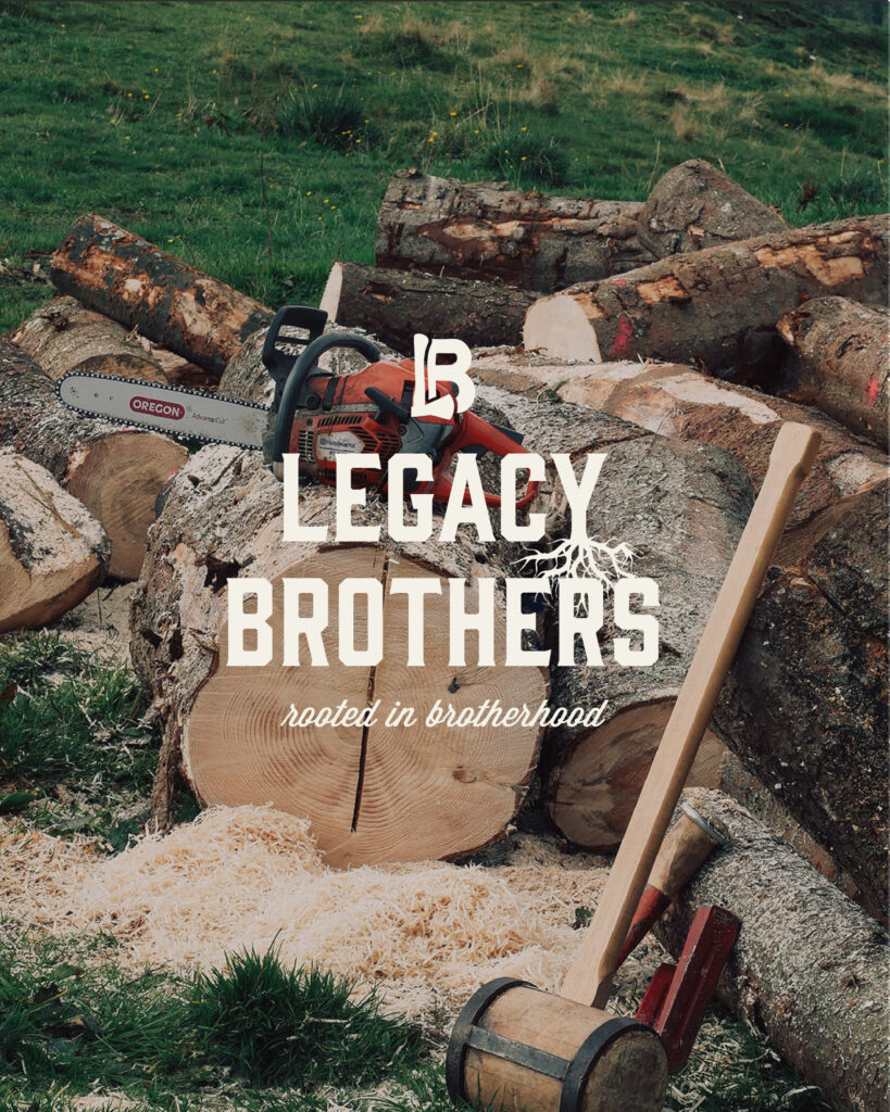
Legacy Brothers is a tree service company located in Harlan, Iowa, but servicing all over Iowa. Their tagline, Rooted in Brotherhood, gives nod to roots of a tree as well as the owners all being brothers: Jonny Bieker, Jameson Bieker, Caleb Bieker, and Jeremiah Bieker. The Bieker brothers also have a strong foundation in their faith, which becomes a part of their business values and mission as a business. The brothers came to me in hopes of creating a brand that made them stand out in their industry and give a sense of professionalism in what they do. We accomplished this by doing some market research and analyzing what the other tree service companies in the area were doing with their brands. Legacy Brothers stands out as quality, trustworthy, outdoorsy, and respectable.
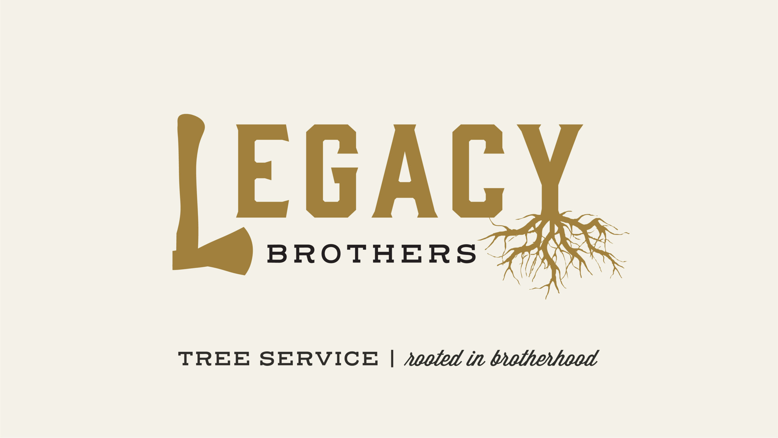
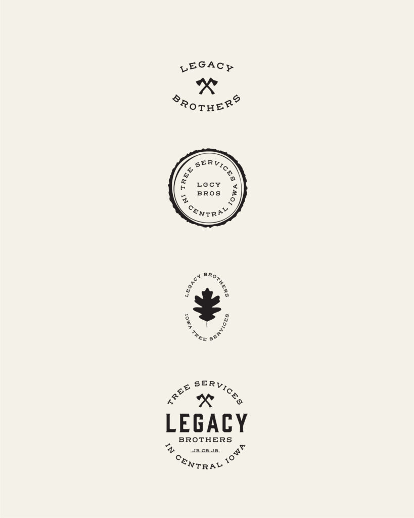
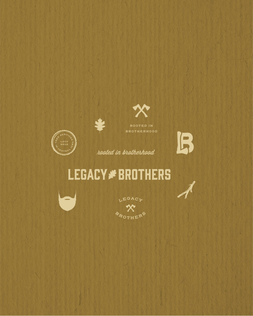
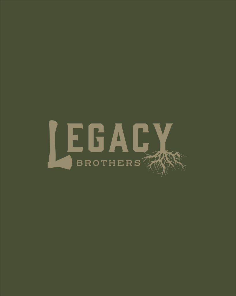
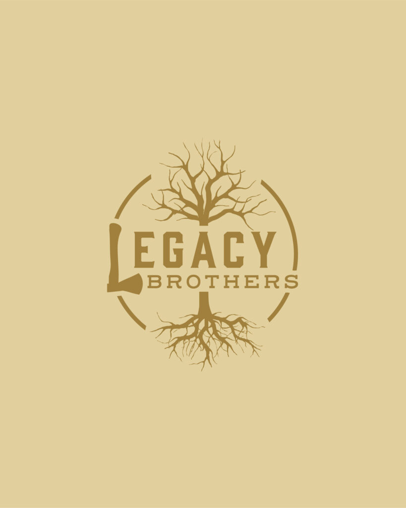
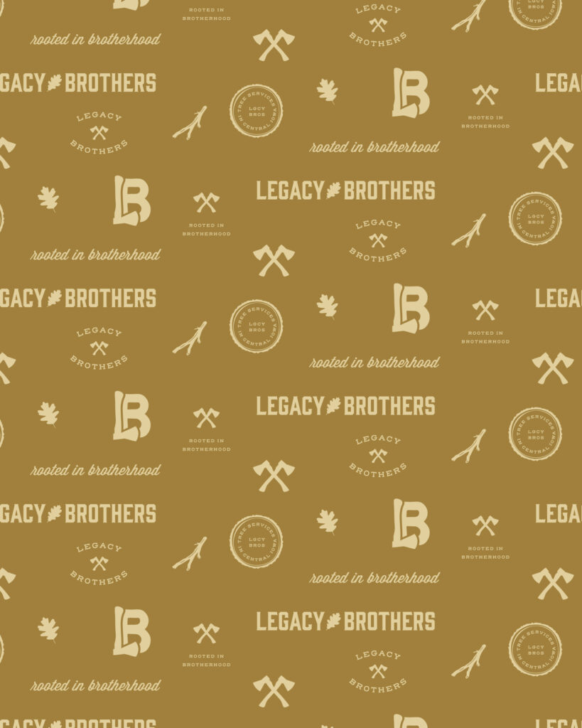
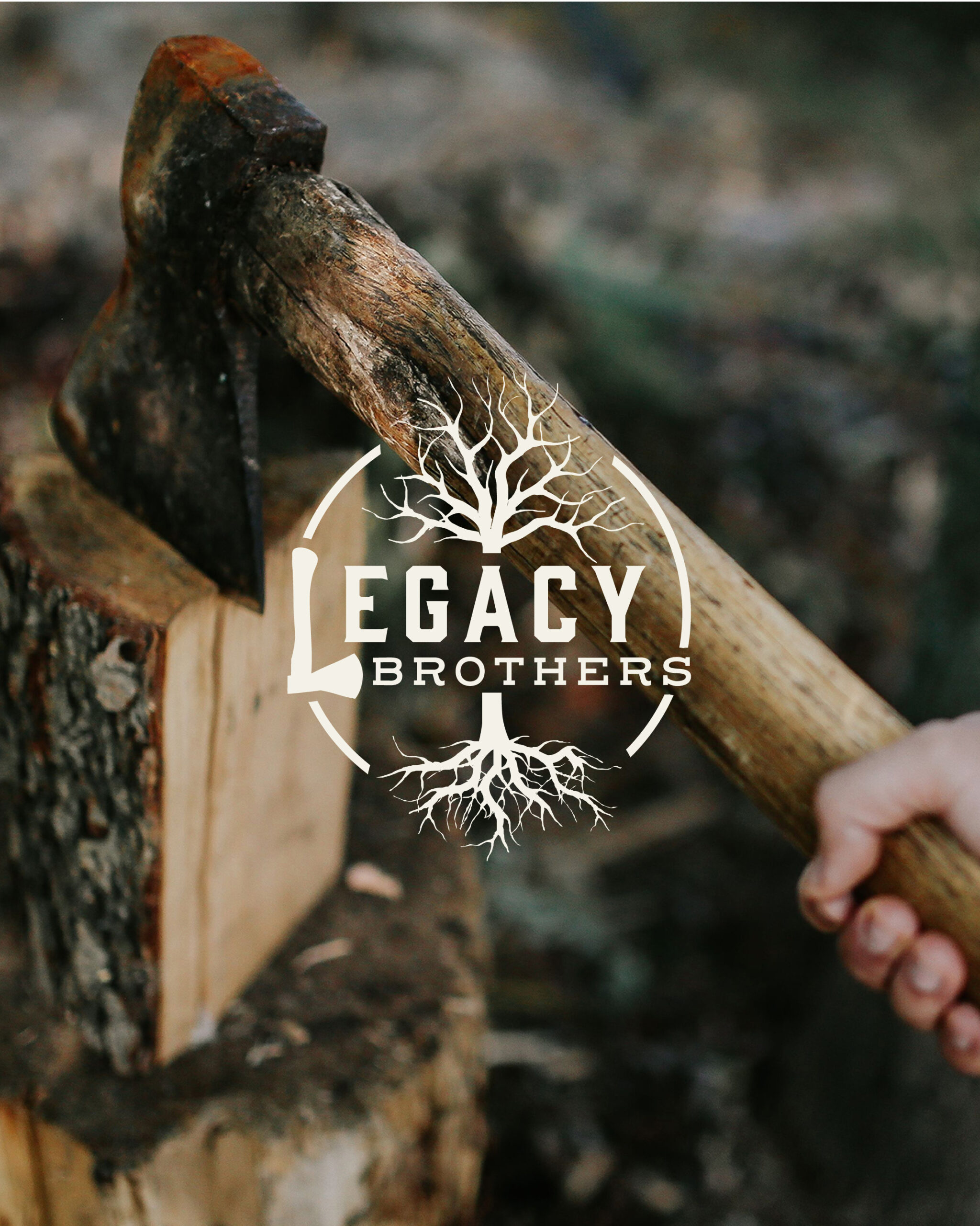
An axe icon shaped as an “L” became part of the primary focus of the logo as well as tree roots. The fonts being used are bold with rugged, sharp corners, symbolizing the kind of work the Legacy Brothers do. The tagline, as mentioned before, creates a sense of relatability and is personable for their audience.

The Legacy Brothers color palette includes organic shades of green and tan with a bright red accent for contrast. Altogether, the color palette feels earthy, rooted, relatable, masculine, and grounded.
Inspiration for this brand included being outdoors, the feeling of brotherhood and family, faith, vintage gas station signage, carpentry, and name tape on mechanic uniforms.
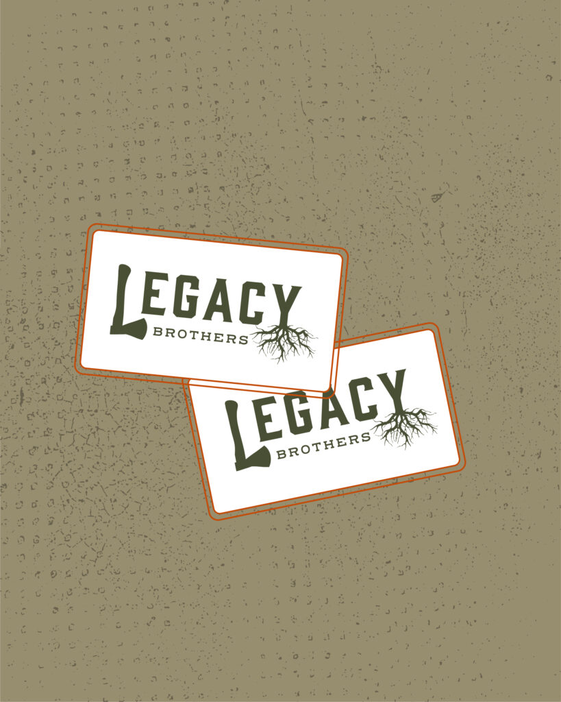
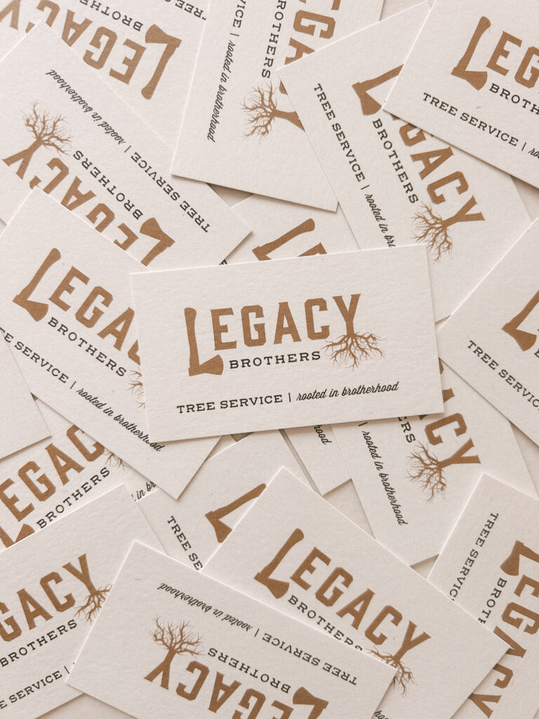
The Legacy Brothers have several brand touchpoints with potential clients where they have incorporated their brand elements such as business cards, yard signs after they complete a project, bidding sheets and invoices, merchandise, and their social media presence.
It brings me joy when I see their brand on a yard sign around town, knowing it can be recognized as the Legacy Brothers’ brand.
Services
Brand design, messaging & taglines, photo direction

Interested in working with Made by Claire to create a strategic, authentic brand like Legacy Brothers for your business? Let’s work together. Get in touch with me today!
Leave a Reply Cancel reply
connect -
Working with Claire on the branding for our company was one of our greatest decisions while launching our company. She was clear and to the point as well as brought out what we felt Legacy Brothers stands for. Thanks a million Claire!